Knowledge Base
Designer
Designer Overview
Designer Version History
Designer Automations
Designer Programs
Designer Profiles
Designer Patients
Designer Custom Data
Designer Visual Components
- Visual Components
- Visual Components & Dependencies
- Filtering With Message Template Variables
- Filtering With Message Template Variables
- How To Create an Assessment or Form Template
- How To Associate Assessments with Programs
- How to Add Assessments to a Template
- How to Configure Scored Assessments
- Create PDFs from Forms & Assessments
- Create Patient Facing Assessment (PFA) Folders
- Charts & Graphs: How to Configure
- Charts & Graphs: Filter, change date and by data point
- Forms: Conditional Logic
Designer Access Control
Designer Task Management
Designer Encounters
Designer Communications
Designer Terminology
Designer Help Page
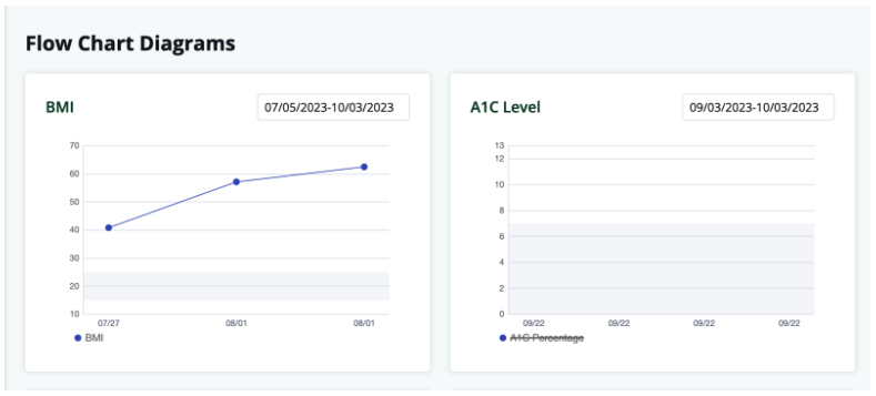
Charts & Graphs: Filter, change date and by data point
Welkin allows you to utilize Data Types to also display in a Chart or Graph. Welkin gives you the ability to visualize data in a: Line Graph, Bar Graph or Pie Chart. If you would like to get an overview about Charts and Graphs you can visit this article first: Charts and Graph.
In this article you will learn how you can utilize Charts and Graphs to review patients data views over a stretch of time and be able to filter single or multiple data points.
Once you have built and published your new Chart and Graphs in Designer they will then show in care. Next, you will need to enter the values for each specific data point you have selected to visualize the data view. As you enter more data points over time you will be able to start to filter by specific dates or lengths of time. Please reference the diagrams below.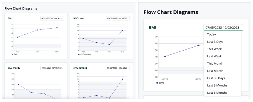
In addition to being able to filter by specific dates and lengths of time you can toggle between the variables. By selecting or deselecting variables that are demonstrated at the bottom left of the Y and X axis points allows you to pick and choose the different variables you would like to see. In the example diagram below you can see the left graph has the data point selected and the right has it deselected. This is to allow you to narrow down specific data elements for each specific patient.
If you are looking for more information about Custom Data Types here a great article Designer: Custom Data Types.